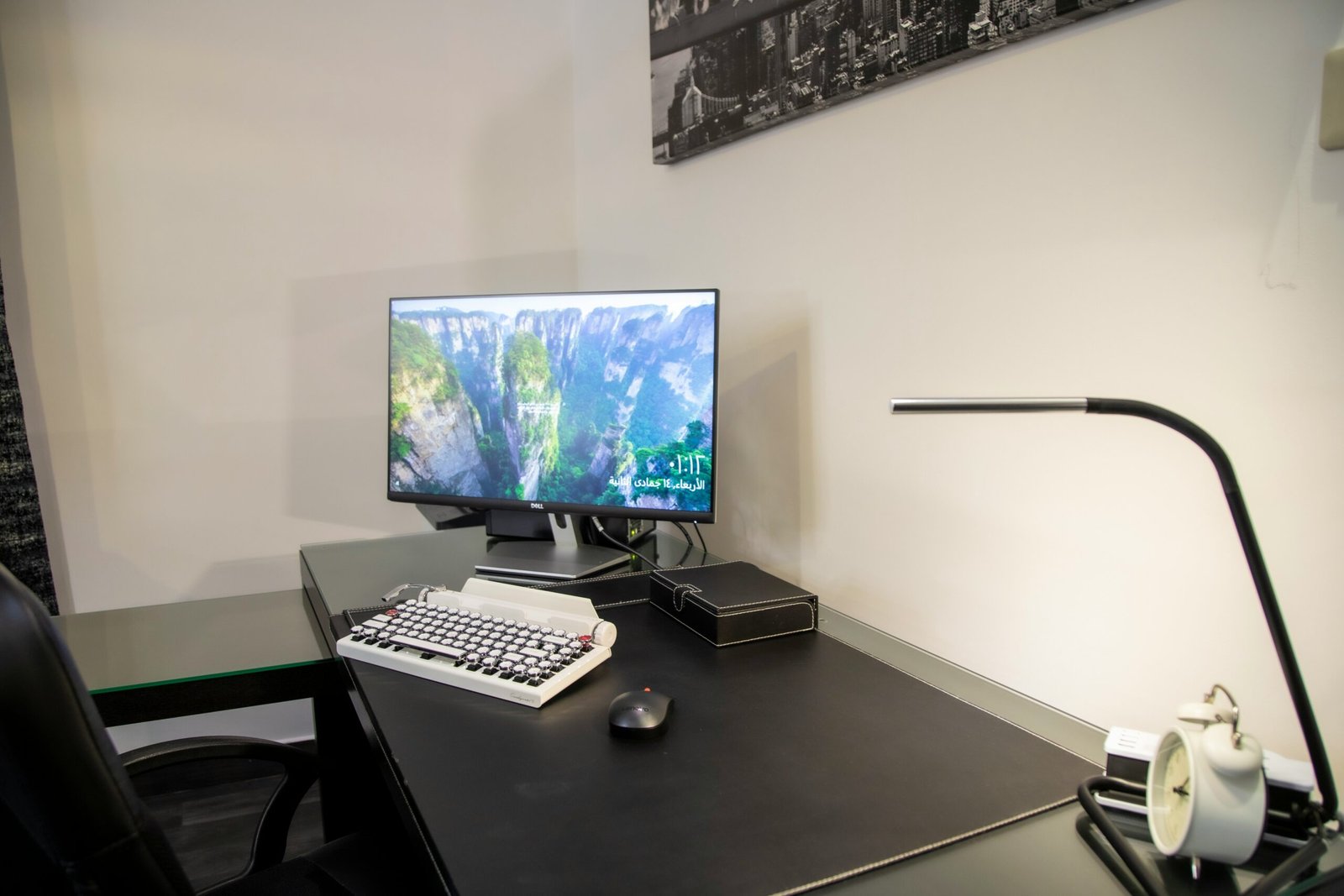
When it comes to interior design, one of the most important aspects to consider is the color palette. The colors you choose for your space can have a significant impact on its overall look and feel. A well-designed color palette can create a harmonious and inviting atmosphere, while a poorly chosen one can make a room feel chaotic and unbalanced. In this blog post, we will explore some hacks for mastering color palettes to help you create the perfect interior design.
Understanding Color Theory
Before diving into the hacks, it’s essential to have a basic understanding of color theory. Colors can be categorized into primary, secondary, and tertiary colors. Primary colors are the base colors that cannot be created by mixing other colors. Secondary colors are created by mixing two primary colors, while tertiary colors are created by mixing a primary color with a secondary color.
Color theory also includes concepts such as complementary colors, analogous colors, and color temperature. Complementary colors are opposite each other on the color wheel and create a vibrant contrast when used together. Analogous colors are next to each other on the color wheel and create a harmonious and cohesive look. Color temperature refers to the warmth or coolness of a color.
1. Start with a Neutral Base
When designing a color palette, it’s often best to start with a neutral base. Neutral colors such as white, beige, and gray provide a versatile and timeless backdrop for any room. They also allow you to add pops of color through furniture, accessories, and artwork. Starting with a neutral base gives you the flexibility to change up your color scheme in the future without needing to make significant changes.
2. Use the 60-30-10 Rule
The 60-30-10 rule is a popular guideline used in interior design to create a balanced color palette. The rule suggests allocating 60% of the room’s color to a dominant color, 30% to a secondary color, and 10% to an accent color. This rule helps create visual interest and prevents the room from feeling overwhelming. For example, you could use a neutral color for 60% of the room, a complementary color for 30%, and a vibrant accent color for 10%.
3. Consider the Mood
Colors have the power to evoke specific moods and emotions. Before finalizing your color palette, consider the mood you want to create in the room. For example, warm colors like red and orange can create a cozy and energetic atmosphere, while cool colors like blue and green can create a calm and relaxing ambiance. Understanding the psychological effects of colors can help you choose the right colors for each space.
4. Experiment with Color Schemes
Don’t be afraid to experiment with different color schemes to find the perfect one for your space. Some popular color schemes include monochromatic, analogous, complementary, and triadic. A monochromatic color scheme uses varying shades of a single color, creating a sophisticated and cohesive look. An analogous color scheme combines colors that are next to each other on the color wheel for a harmonious feel. A complementary color scheme pairs colors that are opposite each other on the color wheel for a bold and contrasting look. A triadic color scheme uses three colors that are evenly spaced on the color wheel for a vibrant and balanced palette.
5. Consider the Lighting
Lighting plays a crucial role in how colors appear in a space. Natural light and artificial lighting can significantly impact the way colors are perceived. When choosing colors for your interior design, consider the lighting conditions in the room. Test the colors under different lighting conditions to ensure they look as intended. For example, a color that looks vibrant and warm in natural light may appear dull and cool under artificial lighting.
6. Don’t Forget About Texture
While color is essential, don’t forget about the role of texture in interior design. Texture adds depth and visual interest to a space. Consider incorporating different textures through fabrics, rugs, wall coverings, and furniture. Textures can enhance the overall look and feel of a room and complement the chosen color palette.
Conclusion
Mastering color palettes is a crucial skill in interior design. By understanding color theory, starting with a neutral base, using the 60-30-10 rule, considering the mood, experimenting with color schemes, taking lighting into account, and incorporating texture, you can create the perfect color palette for any space. Remember to choose colors that resonate with your personal style and create the desired atmosphere. Happy designing!


